Monday, 28 December 2015

Super Fast and Easy Facial Retouching

In this tutorial, I will show you how to repair some image noise from a low-quality shot, and I will show you an extremely quick and easy way to smooth out a person's face. The woman in this shot is not a model, and she has a lot of character so we don't want to overdo it with the smoothing. We will make it look real and natural.
You can get the image we're using in this tutorial from Free Range Stock here. The technique can be applied to a beauty shot as well, you would just have to adjust the settings on some of the steps to get a more extreme smoothing effect.


If you look at the blue channel, you will notice that it doesn't look so good. There are a lot of JPG artifacts that you don't really see when looking at the RGB composite, but it's good to fix it for a variety of reasons. Importantly, it will reduce the color noise in the image and give us more flexibility when making corrections later down the line.
Duplicate the Background layer. On the new layer go to Filter > Blur > Gaussian Blur. Enter 10 for the radius. Hit OK. Set the layer's blending mode to color. Double-click on the layer to the right of the name to open the blending options. Under Advanced Blending, uncheck the R and the G. This makes the layer only affect the blue channel no matter what we do to it. Now go back and check out the blue channel. Looks better.


Now I will use Curves to balance the color in the image. I suggest using Curves over Levels for everything. Curves just gives you much more control.
Download my curve preset to your hard drive.
Create a new Curves Adjustment layer at the top of the layers palette, then click the little button to the right of the Preset control, and select Load Preset and load the file.

The technique that we are going to use to smooth out the face doesn't require very much cloning at all. I do want to use the Healing Brush Tool (J) on any major freckles or blemishes, in this case her four large freckles.


Create a new blank layer just above the background copy. Select the Healing Brush (J) and make sure that "Sample All Layers" is checked on the property bar. Paint over those spots to remove them.
A good rule of thumb is to never modify your source image in any way. That is why we used the healing brush on a new layer. You never know when you might need to go back to where you started.
Select the three layers below the Curve layer. Drag them down to the New Layer button to duplicate them. Hit Command+E to merge the three duplicates.
Select the Polygonal Lasso Tool and click around her face until all the skin is selected. It doesnt need to be too neat. Now go back, and while holding Alt, click around and deselect anything that is not skin like the eyes, eyebrows, lips, and nostrils. Go back once more and deselect any areas of detail that need to remain, like the edge of the nose, her dimples, her collar bones, and the edge of her chin. This is what my selection looks like as a quick mask:


Hit Shift+Command+I to invert the selection and then Delete to delete those pixels. You won't actually notice a change because the layers below are the same as the layer we are working on.
Go Filter > Blur > Gaussian Blur. Enter 20 for the Radius. Set the layer Opacity to 75%. Select and duplicate the same bottom three layers just like we did before. Hit Command+E to merge them. Put that layer just above the blurred layer. With the new layer selected, hit Command+Alt+G. This creates a clipping mask, which is indicated by the arrow pointing down on the layer. This means that the layer on top will use the bottom layer's transparency as a mask.
With your new layer still selected, go to Filter > Other > High Pass. Enter 4 for the Radius.


Now you can really see how that clipping mask is working, but not for long. Set the blending mode of the layer to Linear Light and set the Opacity to 40%. Done!

Rollover the image below to see the before / after...


 This will pretty much work on any portrait, but the goal isn't to make the person look like a model, it's just meant to smooth things out a bit yet still look natural. That is why it works well on everyday average people.

Create Cool Water Color Effects in Photoshop

 Before we get started, let's take a look at the image we'll be creating. Click the screenshot below to view the full-size image.
Create a new document and a new layer. Rename the layer to "texture" and fill it with white. Make sure that the foreground is white and the background is black. Then go to Filter>Texture>Texturizer, and use Canvas for the Texture, 80% Scaling, and 2 for the Relief


Place an image in your document. The one used in this tutorial can be downloaded at this link. Then delete the background. You can use the Path Tool (P) or the Polygonal Lasso Tool (L). Tip: It doesn't need to be perfect because we will apply some filters in the next step.


Select the layer of the girl and go to Image>Adjustments>Levels. We want to increase the whites here. Then go to Image>Adjustments>Hue/Saturation, and change the Saturation to -65.


Now go to Filter>Artistic>Watercolor. Use the following settings: Brush Detail 9, Shadow Intensity 0, and Texture 1.
With the girl's layer selected, go to Layer>Layer Mask>Reveal All. Then select the Brush Tool (B), with black for the color, and mask the body of the girl.
We need the Bittbox Watercolor Brushes 2 that you can download at this link.
Next we create a new layer. Then with the Brush Tool (B) selected, choose the seventh brush from the BB Watercolor Brushes. Use black for the color. Then reduce its size to fit the document. After that, rotate and resize the layer. The idea is to create watercolor-style hair for the girl using the brush.
Now go to Layer>Layer Style>Blending Options. Change the Fill Opacity to 0. Then select the Color Overlay option. Use red for the color and Multiply for the blend mode. For the Opacity use 70%. Then select the Satin option. Use Hard Light for the blend mode, purple (#5d085c) for the color, 20º for the Angle, Distance 4px, and Size 12px.
Create a new layer. Then select another brush with the Brush Tool(B). I used the 17th Bittbox Brush. The concept we're using is to design different creative-looking hairstyles. So let's continue with that. On a new layer, paint some brush strokes in the middle of the screen. Then resize and rotate them until they look good. You should achieve a stylized hair look, as in the image below.
Go to Layer>Layer Style>Blending Options. Set the Fill Options to 0. Then add a Color Overlay. Use Overlay for the blend mode, Blue (#002cec) for the color, and set it to 50% Opacity. Then select Satin. Then use the following settings: a slightly darker blue (#065795) color, a Linear Burn for the blend mode, a 100% Opacity, a 19º Angle, an 11px Distance, and a 14px Size.

Let's brush in some more hair. This time we'll use green. Create a new layer, and select the Brush Tool(B). Then select another brush from the watercolor set. Select the last one, reduce its size, and paint more hair. Use just one click when brushing. After that you can resize and rotate it.
Now go to Layer>Layer Style>Blending Options. Again set the Fill Options to 0. Then add a Color Overlay, use Multiply for the blend mode, Green (#18ff00) for the color, and 100% for the Opacity. Then select Satin. Use the following settings: darker green (#0b9600), Darken for the blend mode, 100% Opacity, 19º Angle, 4px Distance, and 7px Size.
Next we repeat the process one more time. Create a new layer. Then select the Brush Tool(B). Select another brush, reduce its size, and paint more hair. Adjust it by resizing and rotating it until it looks good.
Again, go to Layer>Layer Style>Blending Options. Change the Fill Options to 0. Then add a Color Overlay, use Hard Light for the blend mode, yellow (#ffe400) for the color, and 100% for the Opacity. Then select Satin. Use the following settings: darker yellow (#a2a406), Color Burn for the blend mode, 100% Opacity, 19º Angle, 17px Distance, and 73px Size.
Now select the layer with the girl's face. Change the blend mode to Screen. Then make some adjustments, like fixing the neck using a regular brush with a white color.
Type the text you want; I typed Psdtuts+. Then go to Layer>Layer Style>Gradient Overlay. Create a gradient using Red, Yellow, Green, and Blue. Use 180º for the angle and Normal for the blend mode.
Create another layer, and make sure that the text is on top of this new layer. Then with the Rectangular Marquee Tool, create a rectangle selection and fill it with white. Next we merge these two layers (the text with the white rectangle). This is necessary to add some text effects; otherwise the filters wouldn't work well.

 
Now we apply some filters to the text. First go to Filter>Brush Strokes>Sprayed Strokes. Use Stroke Length 17, Spray Radius 0, and Stroke Direction Vertical. After that go to Filter>Artistic>Watercolor. Use the following settings: Brush Detail 11, Shadow Intensity 0, and texture 1. That will create a nice text effect, or you could experiment with different filters until you achieve optimal results.

 
This tutorial presents a quick and easy way to create a nice design. We achieved this by mixing a photo with watercolor effects. We used some watercolor brushes and played with blend modes. Keep in mind though, if you can paint it for real, you will be able to create very original artwork, like the designers I mentioned before.


Friday, 25 December 2015

Easy Selective Color Effect With Photoshop

In this Photoshop tutorial, we'll learn how to easily add a selective color (or "splash of color") effect to an image, meaning we'll be converting the overall photo to black and white while leaving our main subject in full color.
Even though effects like this are very easy to achieve in Photoshop, many people shy away from them because they don't feel comfortable enough with Photoshop's various selection tool, or they're never sure which selection tool to use. So in this tutorial, we'll see how to create this effect without any selection tools at all! That's right, none! Instead, we'll be using nothing more than a simple Black & White adjustment layer, a layer mask and a brush! If you can drag a few sliders and paint with a brush, you have all the skills you need.
I'll be using Photoshop CC here, but this tutorial is also fully compatible with Photoshop CS6. If you're using Photoshop CS5 or earlier, you can also follow along, or you may want to check out our original Selective Coloring Effect tutorial. Note, though, that the original version require the use of a selection tool, so while the end result is the same, the steps are a bit different from what we'll be covering in this version.

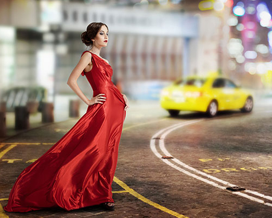
Here's the image I'll be starting with (woman in red dress photo from Shutterstock):


The final effect.

You can follow along using your own image. Simply choose any photo with an object that will remain in color, whether it's a dress, a flower, a phone booth, or whatever the case may be. Let's get started!

Step 1: Add A Black & White Adjustment Layer

With your image newly opened in Photoshop, you'll see in your Layers panel that the document currently contains a single layer - the Background layer - which holds your image:


The Layers panel showing the photo on the Background layer.

We'll create this effect non-destructively, meaning we'll leave the original image untouched and add the selective color effect using a separate adjustment layer. Click on the New Fill or Adjustment Layer icon at the bottom of the Layers panel:


Clicking the New Fill or Adjustment Layer icon.

Choose a Black & White adjustment layer from the list that appears:


Choosing a Black & White adjustment layer.

As the name implies, Photoshop's Black & White adjustment is specifically designed for converting color images to black and white. If we look again in the Layers panel, we see the adjustment layer (named "Black & White 1") sitting above the Background layer:


Photoshop adds the adjustment layer above the image.

And we see in our document that Photoshop has already gone ahead and converted the image to black and white for us using its default settings. We'll customize the black and white version ourselves in a moment:

 The initial, default black and white conversion.

Step 2: Fine-Tune Your Black & White Conversion

The controls for the Black & White adjustment layer are found in the Properties panel. Here, you'll find six sliders, one for each of the three primary colors (Reds, Greens and Blues) and one for each of the three secondary colors (Yellows, Cyans and Magentas). Drag any of the sliders either left or right to darken (left) or lighten (right) any areas in the image that contain that particular color in the full color version. For example, dragging the Reds slider towards the right will lighten any areas that have red in them (in the full color version), while dragging the Blues slider towards the left will darken any areas that were blue. Don't worry about remembering which areas contained which colors. It's easier to just drag the sliders and judge the results. If you like the result, great. If not, simply drag the slider back and try a different slider until you're happy with the way the black and white version looks:


Drag the sliders to lighten or darken different areas based on their original color.

There's also an Auto button above the sliders. Clicking the Auto button tells Photoshop to take its best guess at what the black and white version should look like. Sometimes it works well, sometimes it doesn't, but you can always use the individual sliders to adjust and fine-tune things after giving the Auto button a try:


Clicking the Auto button.

If you want to compare your black and white version with the original full color version of the image, click the adjustment layer's visibility icon (the "eyeball" icon) in the Layers panel to toggle the adjustment layer on and off. With it off, you'll see your full color version. Click the icon again to toggle the adjustment layer back on and you'll see your black and white version:

Clicking the visibility icon to toggle the adjustment layer on and off.

Here's my adjusted black and white conversion. There's no need to get things perfect at this point. As we'll see near the end of the tutorial, you can easily come back and make changes to the sliders later:


My adjusted black and white version.

Step 3: Select The Brush Tool

One of the great features of Photoshop's adjustment layers is that each one comes with a built-in layer mask. I won't get into detail here about how layer masks work, but if you want to learn more about them, be sure to check out our full Understanding Layer Masks tutorial. Even though we can't actually see the mask in the document, we know it's there because we see its layer mask thumbnail in the Layers panel. Note that the thumbnail is currently filled with white, which means the Black & White adjustment layer is affecting the entire image below it:


 The mask thumbnail on the adjustment layer.

We can reveal part of the original full color image through the adjustment layer simply by painting with black on the layer mask. Select the Brush Tool from the Tools panel:

 
Selecting the Brush Tool.

Step 4: Choose A Soft Round Brush

Right-click (Win) / Control-click (Mac) anywhere inside your document to open the Brush Preset Picker and click on the soft round brush in the upper left of the thumbnail area. Press Enter (Win) / Return (Mac) on your keyboard when you're done to close out of the Brush Preset Picker:

Selecting the soft round brush.

Step 5: Set Your Foreground Color To Black

Photoshop uses our current Foreground color as the brush color. We need to paint with black on the layer mask, which means we need to set our Foreground color to black. To quickly do that, press the letter D on your keyboard. This will instantly set the Foreground and Background colors to their defaults, making the Foreground color white and the Background color black (these are the default colors whenever we have a layer mask selected). To swap them, press the letter X on your keyboard. Your Foreground color should now be black.
We can see the current Foreground and Background colors in the color swatches near the bottom of the Tools panel. The Foreground color is the swatch in the upper left. It should be showing black:

The Foreground (upper left) and Background (lower right) color swatches.

Step 6: Paint With A Larger Brush Over The Inside Of The Object

To bring back the color in an object, start by painting over as much of its inner area as possible, avoiding the edges for now. Depending on the size of the object, it may help to use a larger brush for this part. You can change the size of your brush directly from the keyboard. Pressing the right bracket key ( ] ) repeatedly will make the brush larger, while pressing the left bracket key ( [ ) will make it smaller. To adjust the hardness of the brush edge from your keyboard, press and hold your Shift key while pressing the right bracket key ( ] ) repeatedly to make the edge harder or the left bracket key ( [ ) to make it softer.
In my case, I want to bring back the color in the woman's dress, so I'll use a larger brush to paint over as much of it as I can, again avoiding the edges for now. I'll start with the lower part of the dress since it's the easiest:

Painting with black over the lower half of the dress while avoiding the edges.

Then, I'll switch to a slightly smaller brush (by pressing my left bracket key a few times) and paint over as much as I can of the upper part of the dress, still avoiding the edges:

Adding the upper part of the dress.

Notice, if we look at the layer mask thumbnail in the Layers panel, that the areas we're painting over appear black. That's how layer masks work. White represents areas where the effect of the adjustment layer is visible in the image below it. Black represents areas where the effect is hidden. By painting over our object with black, we hide the black and white effect and reveal its original, full color version:

The layer mask thumbnail showing the area we've painted over in black.

Step 7: Paint With A Smaller Brush Around The Edges

To paint around the edges of the object, it often helps to zoom in closer. Here's some handy keyboard navigation tricks to make things easier. To zoom in on an area, press and hold Ctrl+spacebar (Win) / Command+spacebar (Mac) on your keyboard to temporarily access Photoshop's Zoom Tool and click on the area with your mouse. Click repeatedly to zoom in closer. To zoom out, press and hold Alt+spacebar (Win) / Option+spacebar (Mac) and click. To pan around the image while you're zoomed in, press and hold the spacebar on its own to temporarily access the Hand Tool, then click and drag the image around with your mouse.
You'll most likely want to use a smaller brush for the edges since they require more precision, so I'll press the left bracket key a few times to make my brush nice and small. You may also need a harder edge. Again, to change the hardness of the brush edge from the keyboard, press and hold your Shift key while pressing the right bracket key to make the edge harder (or the left bracket key to make it softer). Here, I'm using a small, harder edge brush to slowly make my way along the edges in the upper part of the dress:

Carefully painting along the edges of the dress with a smaller brush.

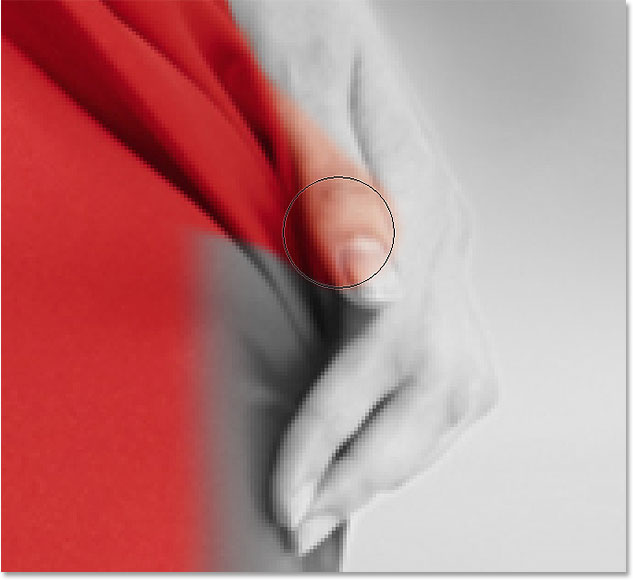
If you make a mistake and accidentally paint across the edge into an area you didn't mean to, not to worry. Here, I've painted over part of the woman's thumb:

  Oops! No problem, it's an easy fix.

To easily fix a mistake like this, simply press the letter X on your keyboard to swap your Foreground and Background colors, making white your Foreground color. Then, paint over the mistake with white to remove the color from that area. When you're done, press the letter X again to set your Foreground color back to black and continue on:

  Fixing the mistake by painting over it with white.

I'll keep making my way around the edges of the dress, zooming, panning and changing my brush size as needed to reveal its color:

Continuing around the edges of the dress.

Here's my final result:

The dress is now back in full color.

Step 8: Re-Adjust The Black & White Sliders If Needed

At this point, you may want to adjust and fine-tune your black and white conversion. To do that, simply go back to your Properties panel and drag the individual color sliders left or right until you're happy with the results. Since we're working with an adjustment layer, we can make as many changes here as we need without over-editing and damaging the image:


Drag the sliders to fine-tune the black and white areas.

Bonus Step: Bring Back Some Of The Original Color

This final step is optional, but since we've created our selective color effect using nothing more than a single Black & White adjustment layer, we can easily restore a hint of the photo's original color. To do that, simply lower the opacity of the adjustment layer. You'll find the Opacity option in the upper right of the Layers panel. I'll lower mine down to around 75%:


Lowering the opacity of the adjustment layer.

This allows a subtle amount of the original color to show through the adjustment layer. Here's the original image once again for comparison:


The original image. 

And here's the result with the red dress in full color and just a hint of color throughout the rest of the image:

  
The effect after lowering the opacity of the adjustment layer.

Thursday, 24 December 2015

Retouch images in Photoshop with Frequence Separation

One of the black arts of photographic retouching is how to achieve the impossibly smooth, yet sharply rendered skin, textures and fabrics seen in fashion and beauty images. Photoshop has its own high quality smoothing and sharpening filters, but the two processes tend to be somewhat contradictory.

In this tutorial, I'll walk you through how I retouch an image from start to finish, using a technique that enables you to selectively process not only different areas of an image, but also different detail levels.

Frequency separation involves creating a high detail (high spatial frequency) layer and a low detail layer from a source image - a particularly clever method of doing this was popularised by Sean Baker, a Maryland-based photographer and retoucher. Using this technique enables you to smooth and rework rough and fine details independently, and opens up some very high-quality and non-destructive methods with which to sharpen your images.

Step 01

In Photoshop, the first step is to ensure you're in 16-bit mode and, using your own photo, create two duplicate layers of your source image. Name the middle layer 'low frequency' and the top 'high frequency'. The bottom is your untouched image, which you may want to reference later.

Step 02

Select the low frequency layer. To create your frequency separated image, you need to remove all the detail from this layer. Select Gaussian Blur. The Radius setting determines the crossover point between your high and low detail layers. This should be the point at which very fine details like skin pores and eyelashes blur. Experiment until you're happy.

Step 03

Now select the high frequency layer, and go to Image>Apply Image. For Layer, select Low frequency from the drop-down menu, and for Blending, select Add (not Linear Dodge Add). Set Scale to 2, Offset to 0, tick the Invert box and hit OK. All being well, you should now have a faint, fine detail layer. Change the Blending Mode to Linear Light.

Step 04

Your original image is now reconstructed with no loss in quality. Select the low frequency layer and apply a surface blur (Filter>Blur). You want enough surface blur to smooth out any inconsistencies in skin tone, without smudging highlights and shadows. I'm using Radius: 11, and Threshold: 10.

Step 05

With your high frequency layer neatly separated, smoothing and painting on your image becomes much less destructive. The light here has cast some hard shadows on the girl's face. Staying on the low frequency layer, use the Eye Dropper and a soft paint brush with Flow set to 1% to smooth the contours of the face.

Step 06

Select the high frequency layer and clean up any blemishes, wrinkles and stray hairs. One of my favourite tools is the Spot Healing Brush. Without the low frequencies, this tool becomes even more effective, enabling you to zap unwanted details without then creating patchy colour inconsistencies.

Step 07

This technique also enables you to apply some very high quality sharpening effects. Duplicate the high frequency layer, add a mask to the new layer, copy and paste the high frequency image into its own mask (Alt/Opt+click the Mask window in the Layers palette), and invert it (Ctrl/Cmd+I).

Step 08

Next create a Dodge and Burn layer to bring out highlights and shadows where you want them. Go to Layer>New> Layer, set the Mode to Overlay, and tick 'Fill with Overlay-neutral color (50% gray)'. Paint on this layer with a soft black or white brush set to 1% Flow. (The image here demonstrates how this layer looks with the Blending Mode set to Normal.)

Step 09

Dodge and Burn can be used with large brushes to create dramatic highlights and shadows. I created another Dodge and Burn layer for the background, and added some light to the image elements I wanted to bring out, such as the cupcakes. I also created a little more glow from the light, and darkened the shadows around the model.

Step 10

After painting, dodging and burning the skin, it's not unusual to find small patchy areas and inconsistencies in your brush work. To check for this, create a Curves adjustment layer with a very exaggerated S-curve: small tonal inconsistencies will be blown up for easier correction.


Step 11

Make your exaggerated curves layer invisible and create another Curves adjustment layer to pull the shadows down a bit. Go to the Blue Channel and add some blue in the shadows. When I'm happy with the outcome, I duplicate this layer so I can mix it in further, without having to change anything.

Step 12

Now create another Curves adjustment layer to tweak the colour. For images that need heavy colour correction, this would be one of the first steps in the retouching process. However, here it's more for a creative effect. Select the Blue Channel and rotate the gradient clockwise by about 10 degrees.

Step 13

Next add a Hue/Saturation layer and a Brightness/Contrast layer, just to balance the image at this stage. Take the Saturation down to -27. When desaturating an image, I set the Blending Mode of the Adjustment layer to Color so that I don't lose any contrast.

Step 14

To add shine and specularity to the highlights, create a new layer and, with white selected as your foreground colour, go to Select>Color Range. Take the Fuzziness up to a point where you can see only the brightest highlights, hit OK, and then fill the selected area with white.

Step 15

For this image I wanted a softer, dream-like quality. The white areas you just filled might be quite grainy, so with this layer selected, add a Gaussian Blur with a Radius of about 5 pixels. This will smooth the white highlights on the skin and add a subtle glow.

Step 16

I also wanted to add some depth to the darker areas of the image, to make sure the focus is on the model and the cupcakes. To do this, simply do the same thing again on a new layer, this time with black selected as your foreground colour, and fill the area in black. Mix this in at a low Opacity, somewhere around 10-20%.

Step 17

Take a look at the image now: one thing dragging the eye away from the model's face and towards the centre is the dark cupcake on the sink. To correct this, I created a new layer, set the Clone Stamp tool to Sample: All Layers in the Tool Options bar, and replaced the dark cupcake with the yellow one next to it.

Step 18

When retouching, some creatives like to liquify an image as the first step but I prefer to leave it until last as this is more of a destructive edit. I'll usually save the image as a Photoshop file, then flatten it for this step. Here I made the nose straighter and reduced the stretch from the earring on the earlobe.